cory.carter@bigpond.comEmergency Towing phoneCALL 0412080036

Tow Truck Adelaide – 24/7 Fast & Affordable Car Towing
Towing Service Near Me? Call now on 0412 080 036
Competitive Towing is your trusted local choice for fast, reliable, and affordable tow truck services in Adelaide. We have over 20 years of experience and provide 24/7 emergency towing for cars, motorcycles, caravans & boats, machinery and more – servicing all Adelaide suburbs. Whether you've broken down, been in an accident, or need a scheduled vehicle relocation, our licensed and police-cleared team is ready to help. We take pride in offering prompt response times, transparent pricing, and friendly service — no matter the time or location.
We provide a free car removal service, in some cases we may pay you for the car. Competitive Towing covers all Adelaide suburbs and are committed to a clean, environmentally friendly service that helps Keep Australia Beautiful. For a cheap towing service in Adelaide we can help!
Why Choose Us?
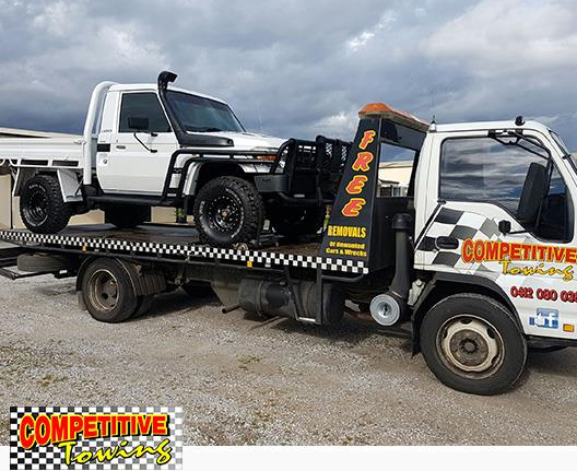
We are locally owned and operated, based in Christies Beach. Our Tilt Tray is fitted with all new technology in transport methods. Chainless transporting using straps and ratchets are only used. We have all the right equipment for sports and lowered vehicles, we can tow any type of motorbikes, scooters all the way to Harleys.
We can tow a range of vehicles including but not limited to:
- Motorbike towing
- Shipping containers
- Small trucks up to 6 tonne
- Excavators bob cats and forklifts
- Transport Boats and caravans
- We even pay cash for unwanted cars
- We service metropolitan Adelaide and SA country
Read more about us or you can call on 0412 080 036 or send an email through our contact page.
Our Services Include
Emergency Towing
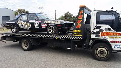
We offer 24-hour emergency towing service Anytime and Anywhere in Adelaide. Need a tow in a hurry call us now on 0412 080 036.
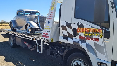
Car Towing
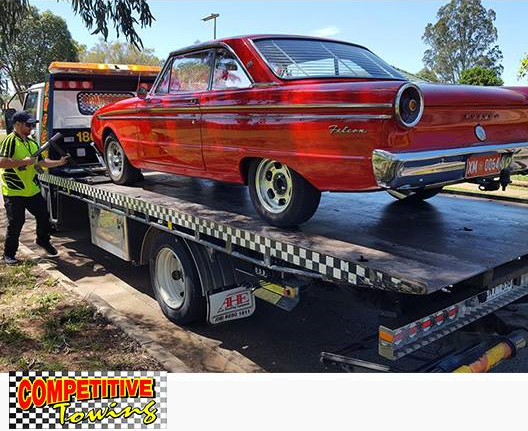
We offer affordable car towing services in Adelaide and country SA. Our highly experienced tow truck drivers will ensure your vehicle arrives safely at its destination. Did you know we also transport prestige vehicles?
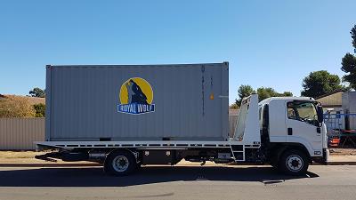
Shipping Container Transport
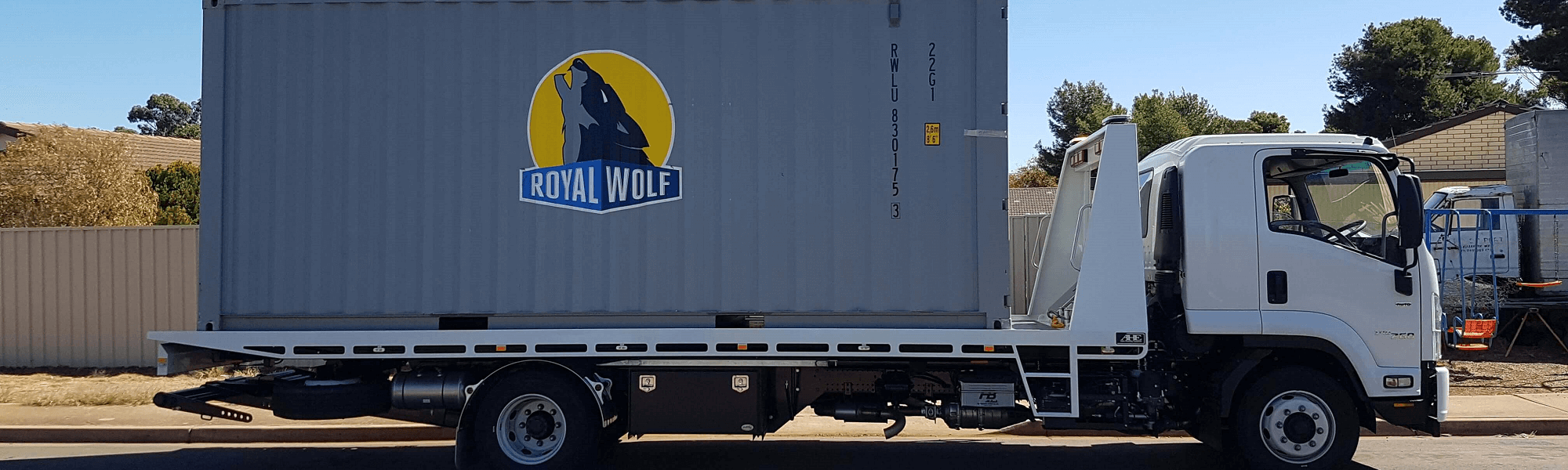
Looking to relocate a shipping container in Adelaide? Competitive towing can tow shipping containers up to 20 feet in size. Our tray is almost 7.5 meters in length making it the perfect solutions for small to medium sized containers. For a cheap towing service in Adelaide or surrounding area's we are here to help!
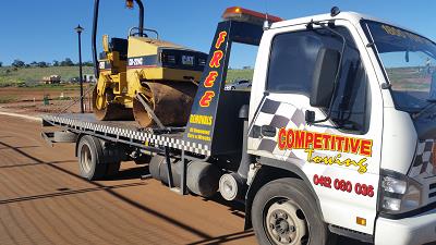
Machinery Towing
We can move small machinery across Adelaide. Call us today to discuss the size and weight of your machinery and we will let you know what we can do.
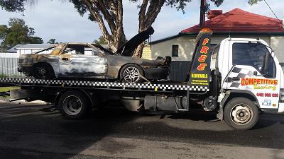
Car Salvage
Looking for a local tow truck company in Adelaide to pick your car up for FREE?
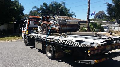
General Towing
Need a tow truck in Adelaide? Competitive Towing provides general towing services. This includes transporting prestige vehicles, vehicles involved in a road crash incident and much more.
Did you know we can transport your prestige vehicle to its next event?
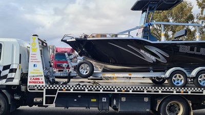
Boat & Caravan Towing
Need help moving a boat of caravan? We can fit a large range of boats and caravans on our tilt tray tow truck. Professional towing service at competitive rates! Call us today for a quote 0412 080 036.
We offer competitive pricing within Adelaide and surrounding suburbs. Many of our customers find us by simply searching for a towing truck near me — and we always aim to be the first and best choice that shows up.
See what our customers have to say about us.
Best operator in town! Always fair prices, professional service, flexible & polite! Highly recommended! Professional job done and very easy to communicate with, which seems to be something many others lack in the industry. Handled my vehicle with care! Great prices also, would definitely recommend. I would highly recommend competitive towing if you ever need your car towed. Very reliable, very quick, very good prices also. Very polite. Thank you Cory. On time. Managed to solve a small logistical issue I had with no fuss. Great price. Definitely recommend. Friendly phone manner, very fast pickup and delivery of broken down van. Competitive rates. Highly recommended!
Great service, efficient, experienced, refreshingly enthusiastic and willing to help out at a great rate. Great service from Cory. On time, fair price and great people skills . Thanks Cory for your help!! Would definitely recommend him to any one. I broke down rang competitive towing and he was amazing. He pick up my keys and towed my car because i was running late for work. Pricing is very fare and hes professional at job. Thanks mate for your help i would recommend his services.

Uncategorised
OSP Real Homes was developed with extreme focus on typography and we believe it provides the most comprehensive content presentation capability. Headings, text, links, tables, images, everything was designed with high level of refinement. Let's take a look.
1. Heading
This is an H1 Header
Lorem ipsum dolor sit amet consectetuer eleifend elit vel tellus laoreet. At ut pellentesque risus quis sem eros et consequat enim lorem. Aenean lorem consequat consequat eu.
This is an H2 Header
Lorem ipsum dolor sit amet consectetuer eleifend elit vel tellus laoreet. At ut pellentesque risus quis sem eros et consequat enim lorem. Aenean lorem consequat consequat eu.
This is an H3 Header
Lorem ipsum dolor sit amet consectetuer eleifend elit vel tellus laoreet. At ut pellentesque risus quis sem eros et consequat enim lorem. Aenean lorem consequat consequat eu.
This is an H4 Header
Lorem ipsum dolor sit amet consectetuer eleifend elit vel tellus laoreet. At ut pellentesque risus quis sem eros et consequat enim lorem. Aenean lorem consequat consequat eu.
This is an H5 Header
Lorem ipsum dolor sit amet consectetuer eleifend elit vel tellus laoreet. At ut pellentesque risus quis sem eros et consequat enim lorem. Aenean lorem consequat consequat eu.
This is an H6 Header
Lorem ipsum dolor sit amet consectetuer eleifend elit vel tellus laoreet. At ut pellentesque risus quis sem eros et consequat enim lorem. Aenean lorem consequat consequat eu.
2. Text styles
Preformatted text (<pre> tag)
  div.grid-layout2 div.grid-col {
  float: left;
  width: 49.95%;
}
div.grid-layout3 div.grid-col {
float: left;
width: 33.3%;
}
Quote text (<blockquote> tag)
You can us this style to quote somebody's speech, idea or a fragment from some book, articles, etc. Lorem ipsum dolor sit amet consectetuer eleifend elit vel tellus laoreet. At ut pellentesque risus quis sem eros et consequat enim lorem. Aenean lorem consequat consequat eu.Usage: <blockquote>This is your quote</blockquote>
Highlighted Text
You can use this style to highlight important words and / or keyword expression in search result page. Lorem ipsum dolor sit amet consectetuer eleifend elit vel tellus laoreet. At ut pellentesque risus quis sem eros et consequat enim lorem. Aenean lorem consequat consequat eu.
Usage: <span class="highlight">This is the text to be highlighted.</span>
Highlighted Text on mouse over
You can use this style to highlight important text block on mouse over. Just roll mouse over this text block to see how it's highlighted.
Usage: <div class="box-highlight">This is the text to be highlighted.</div>
You can use this style to highlight important text block on mouse over. Just roll mouse over this text block to see how it's highlighted.
Usage: <div class="box-highlight">This is the text to be highlighted.</div>
Alert Text
You can use this style for alert or warning text paragraph requiring user's attention. At ut pellentesque risus quis sem eros et consequat enim lorem. Aenean lorem consequat consequat eu.
Usage: <p class="text-alert">This is text that requires user's attentions.</p>
Info Text
You can use this style for regular information text paragraph that does not require much user's attentions. At ut pellentesque risus quis sem eros et consequat enim lorem. Aenean lorem consequat consequat eu.
Usage: <p class="text-info">This is your d text.</p>
Download Text
You can use this style for information text paragraph related to download process. At ut pellentesque risus quis sem eros et consequat enim lorem. Aenean lorem consequat consequat eu.
Usage: <p class="text-download">This is download related text.</p>
Tip Text
You can use this style for useful information like tips, hint or help text. At ut pellentesque risus quis sem eros et consequat enim lorem. Aenean lorem consequat consequat eu.
Usage: <p class="text-tip">This is yourtip hint or help text.</p>
Comment Text
Attachment Text
Video Text
You can use this style for description text paragraph that related to video file. At ut pellentesque risus quis sem eros et consequat enim lorem. Aenean lorem consequat consequat eu.
Usage: <p class="text-video">This is your video related text.</p>
Audio Text
You can use this style for description text paragraph related to audio file. At ut pellentesque risus quis sem eros et consequat enim lorem. Aenean lorem consequat consequat eu.
3. Table Styles
Basic example
For basic styling—light padding and only horizontal dividers—add the base class .table to any <table>. It may seem super redundant, but given the widespread use of tables for other plugins like calendars and date pickers, we've opted to isolate our custom table styles.
| # | First Name | Last Name | Username |
|---|---|---|---|
| 1 | Mark | Otto | @mdo |
| 2 | Jacob | Thornton | @fat |
| 3 | Larry | the Bird |
<table class="table">
  ...
</table>
Striped rows
Use .table-striped to add zebra-striping to any table row within the <tbody>.
Cross-browser compatibility
Striped tables are styled via the :nth-child CSS selector, which is not available in Internet Explorer 8.
| # | First Name | Last Name | Username |
|---|---|---|---|
| 1 | Mark | Otto | @mdo |
| 2 | Jacob | Thornton | @fat |
| 3 | Larry | the Bird |
<table class="table table-striped">
  ...
</table>
Bordered table
Add .table-bordered for borders on all sides of the table and cells.
| # | First Name | Last Name | Username |
|---|---|---|---|
| 1 | Mark | Otto | @mdo |
| 2 | Jacob | Thornton | @fat |
| 3 | Larry | the Bird |
<table class="table table-bordered">
  ...
</table>
Hover rows
Add .table-hover to enable a hover state on table rows within a <tbody>.
| # | First Name | Last Name | Username |
|---|---|---|---|
| 1 | Mark | Otto | @mdo |
| 2 | Jacob | Thornton | @fat |
| 3 | Larry | the Bird |
<table class="table table-hover">
  ...
</table>
Condensed table
Add .table-condensed to make tables more compact by cutting cell padding in half.
| # | First Name | Last Name | Username |
|---|---|---|---|
| 1 | Mark | Otto | @mdo |
| 2 | Jacob | Thornton | @fat |
| 3 | Larry the Bird | ||
<table class="table table-condensed">
  ...
</table>
Contextual classes
Use contextual classes to color table rows or individual cells.
| Class | Description |
|---|---|
.active |
Applies the hover color to a particular row or cell |
.success |
Indicates a successful or positive action |
.info |
Indicates a neutral informative change or action |
.warning |
Indicates a warning that might need attention |
.danger |
Indicates a dangerous or potentially negative action |
| # | Column heading | Column heading | Column heading |
|---|---|---|---|
| 1 | Column content | Column content | Column content |
| 2 | Column content | Column content | Column content |
| 3 | Column content | Column content | Column content |
| 4 | Column content | Column content | Column content |
| 5 | Column content | Column content | Column content |
| 6 | Column content | Column content | Column content |
| 7 | Column content | Column content | Column content |
| 8 | Column content | Column content | Column content |
| 9 | Column content | Column content | Column content |
<!-- On rows -->
<tr class="active">...</tr>
<tr class="success">...</tr>
<tr class="warning">...</tr>
<tr class="danger">...</tr>
<tr class="info">...</tr>

<!-- On cells (`td` or `th`) -->
<tr>
  <td class="active">...</td>
  <td class="success">...</td>
  <td class="warning">...</td>
  <td class="danger">...</td>
  <td class="info">...</td>
</tr>
Responsive tables
Create responsive tables by wrapping any .table in .table-responsive to make them scroll horizontally on small devices (under 768px). When viewing on anything larger than 768px wide, you will not see any difference in these tables.
Vertical clipping/truncation
Responsive tables make use of overflow-y: hidden, which clips off any content that goes beyond the bottom or top edges of the table. In particular, this can clip off dropdown menus and other third-party widgets.
Firefox and fieldsets
Firefox has some awkward fieldset styling involving width that interferes with the responsive table. This cannot be overriden without a Firefox-specific hack that we don't provide in OSP Real Homes:
@-moz-document url-prefix() {
  fieldset { display: table-cell; }
}| # | Table heading | Table heading | Table heading | Table heading | Table heading | Table heading |
|---|---|---|---|---|---|---|
| 1 | Table cell | Table cell | Table cell | Table cell | Table cell | Table cell |
| 2 | Table cell | Table cell | Table cell | Table cell | Table cell | Table cell |
| 3 | Table cell | Table cell | Table cell | Table cell | Table cell | Table cell |
| # | Table heading | Table heading | Table heading | Table heading | Table heading | Table heading |
|---|---|---|---|---|---|---|
| 1 | Table cell | Table cell | Table cell | Table cell | Table cell | Table cell |
| 2 | Table cell | Table cell | Table cell | Table cell | Table cell | Table cell |
| 3 | Table cell | Table cell | Table cell | Table cell | Table cell | Table cell |
<div class="table-responsive">
  <table class="table">
    ...
  </table>
</div>
4. Lists
Unordered
A list of items in which the order does not explicitly matter.
- Lorem ipsum dolor sit amet
- Consectetur adipiscing elit
- Integer molestie lorem at massa
- Facilisis in pretium nisl aliquet
- Nulla volutpat aliquam velit
- Phasellus iaculis neque
- Purus sodales ultricies
- Vestibulum laoreet porttitor sem
- Ac tristique libero volutpat at
- Faucibus porta lacus fringilla vel
- Aenean sit amet erat nunc
- Eget porttitor lorem
<ul>
  <li>...</li>
</ul>
Ordered
A list of items in which the order does explicitly matter.
- Lorem ipsum dolor sit amet
- Consectetur adipiscing elit
- Integer molestie lorem at massa
- Facilisis in pretium nisl aliquet
- Nulla volutpat aliquam velit
- Faucibus porta lacus fringilla vel
- Aenean sit amet erat nunc
- Eget porttitor lorem
<ol>
  <li>...</li>
</ol>
5. Buttons
Use any of the available button classes to quickly create a styled button.
<!-- Standard button -->
<button type="button" class="btn btn-default">Default</button>

<!-- Provides extra visual weight and identifies the primary action in a set of buttons -->
<button type="button" class="btn btn-primary">Primary</button>

<!-- Indicates a successful or positive action -->
<button type="button" class="btn btn-success">Success</button>

<!-- Contextual button for informational alert messages -->
<button type="button" class="btn btn-info">Info</button>

<!-- Indicates caution should be taken with this action -->
<button type="button" class="btn btn-warning">Warning</button>

<!-- Indicates a dangerous or potentially negative action -->
<button type="button" class="btn btn-danger">Danger</button>

<!-- Deemphasize a button by making it look like a link while maintaining button behavior -->
<button type="button" class="btn btn-link">Link</button>
6. Labels
Add any of the below mentioned modifier classes to change the appearance of a label.
<span class="label label-default">Default</span>
<span class="label label-primary">Primary</span>
<span class="label label-success">Success</span>
<span class="label label-info">Info</span>
<span class="label label-warning">Warning</span>
<span class="label label-danger">Danger</span>
7. Badges
Easily highlight new or unread items by adding a <span class="badge"> to links, navs, and more.
<a href="#">Inbox <span class="badge">42</span></a>

<button class="btn btn-primary" type="button">
  Messages <span class="badge">4</span>
</button>
Self collapsing
When there are no new or unread items, badges will simply collapse (via CSS's :empty selector) provided no content exists within.
Cross-browser compatibility
Badges won't self collapse in Internet Explorer 8 because it lacks support for the :empty selector.
Adapts to active nav states
Built-in styles are included for placing badges in active states in pill navigations.
<ul class="nav nav-pills" role="tablist">
  <li role="presentation" class="active"><a href="#">Home <span class="badge">42</span></a></li>
  <li role="presentation"><a href="#">Profile</a></li>
  <li role="presentation"><a href="#">Messages <span class="badge">3</span></a></li>
</ul>Page 5 of 5
Google Reviews
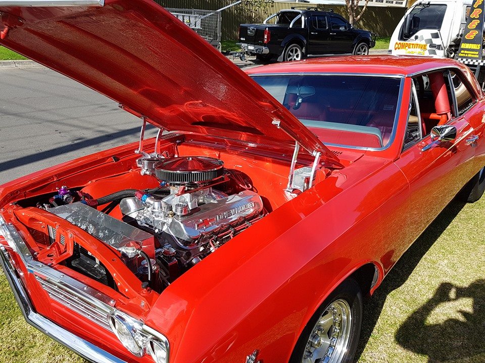
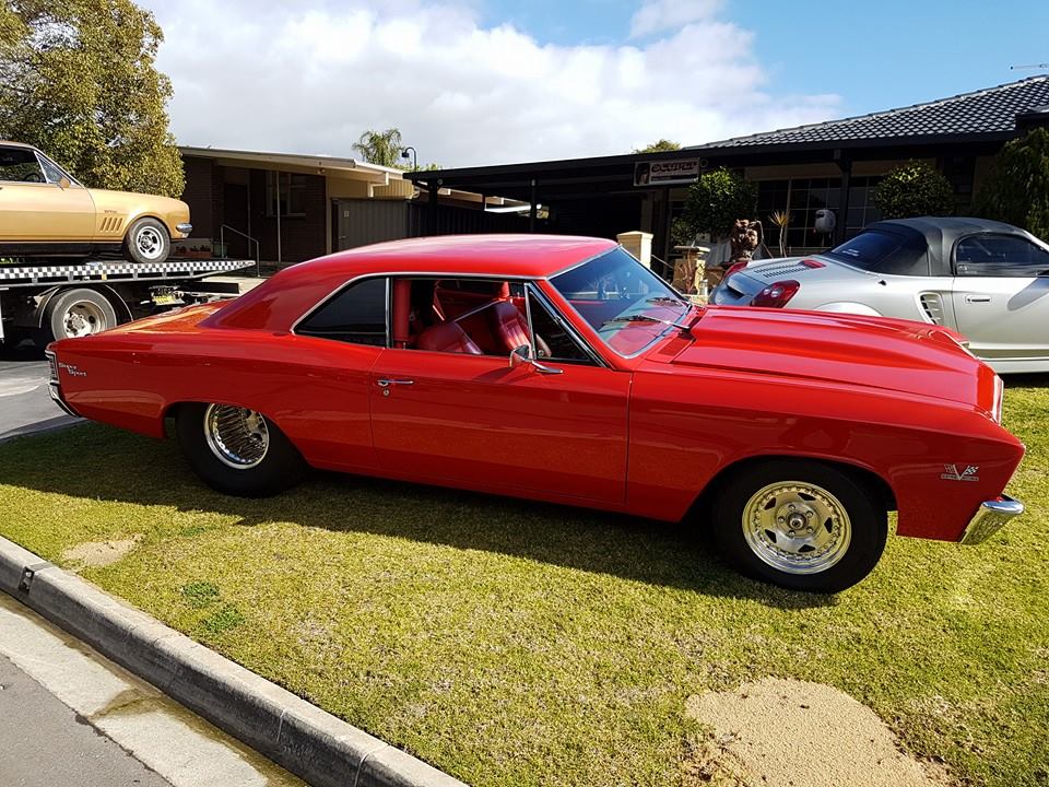
Pic of the Month
You can use this style for comment text paragraph. At ut pellentesque risus quis sem eros et consequat enim lorem. Aenean lorem consequat consequat eu.
Usage: <p class="text-comment">This is your comment text.</p>